Inspiration | Orla Kiely

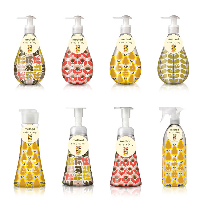
Orla Kiely is a London-based textile designer who creates simple, bold, and graphic patterns. She built a global empire by pairing simple modern shapes with midcentury-inspired color palettes. Her work is an amazing example of consistent and immediately recognizable branding.

Orla's most popular design, the stem pattern, can be found on everything from bedding, bags, and rugs to wallpaper, shirts, and even casserole dishes. She sells higher-end items online and in her New York and London shops. She also sells items at a lower price point through her exclusive Target line.

I love the way Orla's overall brand works together. If you isolate the shapes themselves, they don't have a lot in common and are not very remarkable, but the manner in which she repeats them is interesting and consistent. This gives everything a great unexpected cohesiveness that is able to evolve but still feel very much part of the collection.

e19f26da232cd05e2027f30572f8259f.jpg
75d7b189e531a9d5d394774e7b4e9c2f.jpg

Orla's patterns are a really great example of taking something very simple and giving it a unique personality that translates into a strong, upbeat, and recognizable brand.


Inspiration | Method Products

In 2000, two friends, designer Eric Ryan and chemical engineer Adam Lowry, who'd spent years brainstorming which products they could reinvent, finally made a decision: cleaning products. The two set off on a journey to recreate everyday cleaning products in a whole new way. In addition to being beautiful, they would be eco-friendly, non-toxic, and pleasantly fragrant.

Every element of their product line is carefully crafted from a design perspective. The shape of their bottles, the bright colors, and the pithy language adds an overall cheerfulness to the experience of cleaning, which would typically be a pretty uninspiring event.

Limited Edition | Orla Kiely for Method

Limited Edition | Orla Kiely for Method

In addition to their regular line, the Method guys keep it fresh with seasonal, holiday, and limited-edition products, as well as their "design for good" line that promotes awareness for causes close to their hearts. 

Breast Cancer Awareness

Breast Cancer Awareness

Animal Cruelty, Breast Cancer, Prostate Cancer Awareness

Animal Cruelty, Breast Cancer, Prostate Cancer Awareness

Summer Collection

Summer Collection

Method's dedication to beautiful design is really inspiring. They've taken a pretty ordinary product and turned it into something really luxurious and gift-worthy. They continue to evolve their company and their product line, and I can't wait to see what they'll do next.

Spring Collection

Spring Collection

'Like' my Facebook page to be notified when new posts go up!


Inspiration | Underwood by Union Wine Co.

Underwood Cans were originally created specifically for an event in 2013 to promote Union Wine Co.'s belief that wine was a bit too fussy. They were so popular that the company put them into production and released them in June 2014.

Wine hasn't evolved as quickly as craft beer has in recent years, so I love that this company decided to do something a little bit different--not only with the physical packaging but with the look of their labels as well. Union Wine Co. has taken a simple, utilitarian approach to their labels, which interestingly enough elevates their product by making it stand out dramatically from other wines. Visually, this approach positions it in the trendy craft beer world as a wine craft beer drinkers would enjoy, which is a unique spot.

The cans also solve a pretty common problem among wine drinkers: portability. Beer is so simple to transport, all you need is a cooler. With wine you need a cooler, glasses, a corkscrew--and there's still a risk of the bottle breaking or spilling once it's opened. Some venues also don't allow glass, so you're limited to wine in a box or those ridiculous individual portions that look like juice boxes. This product solves the issue by making wine as portable and easy to consume as beer and not making you feel weird about it.

In addition to being attractive and less pretentious, there are so many benefits to wine in a can! 

  • Cans do a better job of keeping light and oxygen out, which can be detrimental to the taste.
  • A can chills faster and stay cold longer.
  • Cans are less expensive to produce and don't require a separate labeling machine.
  • Aluminum is much lighter and cans are more compact and stackable, making them cheaper and easier to ship.

I absolutely love the thought process behind the development of these cans. They solve a real problem for wine drinkers and look good doing it. Cheers to Union Wine Co.!