Inspiration | Underwood by Union Wine Co.

Underwood Cans were originally created specifically for an event in 2013 to promote Union Wine Co.'s belief that wine was a bit too fussy. They were so popular that the company put them into production and released them in June 2014.

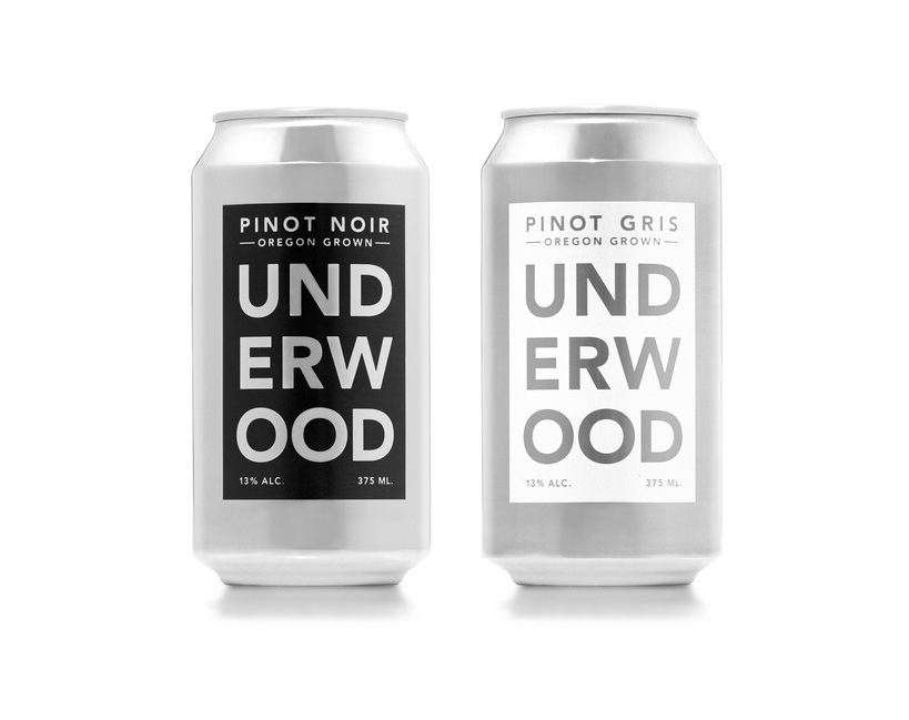
Wine hasn't evolved as quickly as craft beer has in recent years, so I love that this company decided to do something a little bit different--not only with the physical packaging but with the look of their labels as well. Union Wine Co. has taken a simple, utilitarian approach to their labels, which interestingly enough elevates their product by making it stand out dramatically from other wines. Visually, this approach positions it in the trendy craft beer world as a wine craft beer drinkers would enjoy, which is a unique spot.

The cans also solve a pretty common problem among wine drinkers: portability. Beer is so simple to transport, all you need is a cooler. With wine you need a cooler, glasses, a corkscrew--and there's still a risk of the bottle breaking or spilling once it's opened. Some venues also don't allow glass, so you're limited to wine in a box or those ridiculous individual portions that look like juice boxes. This product solves the issue by making wine as portable and easy to consume as beer and not making you feel weird about it.

In addition to being attractive and less pretentious, there are so many benefits to wine in a can! 

  • Cans do a better job of keeping light and oxygen out, which can be detrimental to the taste.
  • A can chills faster and stay cold longer.
  • Cans are less expensive to produce and don't require a separate labeling machine.
  • Aluminum is much lighter and cans are more compact and stackable, making them cheaper and easier to ship.

I absolutely love the thought process behind the development of these cans. They solve a real problem for wine drinkers and look good doing it. Cheers to Union Wine Co.!


Metallic Paper and Specialty Treatments - What Works, What Doesn't

Metallic paper has always been a go-to for me when working on high-end projects. I've used it for vanity tickets, invitations, holiday cards, leave-behinds, and packaging. It's a great way to add a little sparkle to any print piece (when appropriate of course). However, if you're trying to incorporate some specialty treatments, it can be a finicky paper. Below is a list of paper-and-treatment combinations and the reasons why they do or do not work.

Gmund Reaction - Dark Silver Cloud + Blind Emboss

Gmund Reaction - Dark Silver Cloud + Blind Emboss


Metallic Paper + Metallic PMS

NO | Metallic paper is already sparkly and shiny--adding a metallic PMS doesn't make it any sparklier or shinier. This paper also has a particular coating that makes it slick, and a metallic PMS takes FOREVER to dry on this surface.

Metallic Paper + Hologram

RISKY | Holograms can often have a hard time sticking to many metallic papers, so you'll need to work with a printer who is very experienced with them. You should have a few back up papers selected in case your first choice doesn't work. Proceed with caution on this combination.

Metallic Paper + Clear Foil Stamp

NO | Adding a shiny clear foil stamp may look great on a matte paper, but the contrast on a metallic paper isn't great, which makes it a pointless and expensive addition.

Metallic Paper + Metallic Foil

RISKY | If you're using gold or silver foil, it really depends on what you're stamping. If it's a large pattern or a simple shape, it could work. I don't recommend small text; the shiny metallic paper and the shiny text make it almost impossible to read.

Metallic Paper + Black Foil

YES | A black foil stamp looks great on metallic paper! It's even better if you go with a matte finish stamp. The rich black color gives your eye a nice break from all the sparkle.

Metallic Paper + Soft Touch

NO | This is one of those pointless combinations. You're paying a premium for this type of paper, so dulling it down with a soft touch coating doesn't really make sense.

Metallic Paper + Bar Code

NO | This seems like such an obvious combination. You're designing a beautiful vanity ticket or some high-end packaging, why not use a metallic paper! If you need to add a bar code, certain scanners can't read the code when printed directly on this type of paper. In some cases you can test it out ahead of time, but it's an INCREDIBLY risky move with major consequences if it doesn't work out--so for me, it's a no.

Metallic Paper + Blind Emboss

YES | A blind emboss on metallic paper looks amazing! This is definitely a treatment that works well.

Metallic Paper + Die Cutting

YES | Die cutting is another winner that works great with this paper.


Metallic PMS | Source

Hologram  | Source

Clear Foil Stamp | Source

Metallic Foil St | Source

Metallic Foil St | Source

Black Foil Stamp | Source

Soft Touch | Source

Soft Touch | Source

Blind Emboss | Source

Die Cut | Source


Inspiration | Starbucks Reserve Coffee Taster Cards

If you've been to Starbucks lately, you may have noticed a new line of coffee, Starbucks Reserve. They are positioning this line as an exceptional, rare blend with exotic and distinct flavors. It's also only available for a limited time in certain stores, which makes it a bit sought after. You'll notice the distinctly different packaging, as well as Coffee Taster Cards that you can pick up on your way out.

StarbucksReserveCoffeeCards2.jpg

These cards are awesome for a number of reasons. When conceptualizing a custom piece like this, the context is really important. Starbucks customers on average are probably on their way somewhere and in a hurry. These small cards are easy to pick up and pocket. A larger card--or worse yet, a brochure--would not be as convenient and most likely would get tossed. This concept was created as a series and is more than just an informational piece. It's a collectable art piece. The beautiful patterns are intermixed with foil stamping on the front, and the back features an easy to understand, well-designed chart so the user can absorb information at a glance.

The overall design, shape, and size make this piece feel expensive, but print-wise these were relatively inexpensive to produce. I did a similar print quote to compare, and it came in cheaper per piece than a brochure would have.

My favorite thing about this series is that it doesn't feel like you're doing the company a favor by reading their materials. It really feels like they're giving you something of value, and that makes this project inspirational.