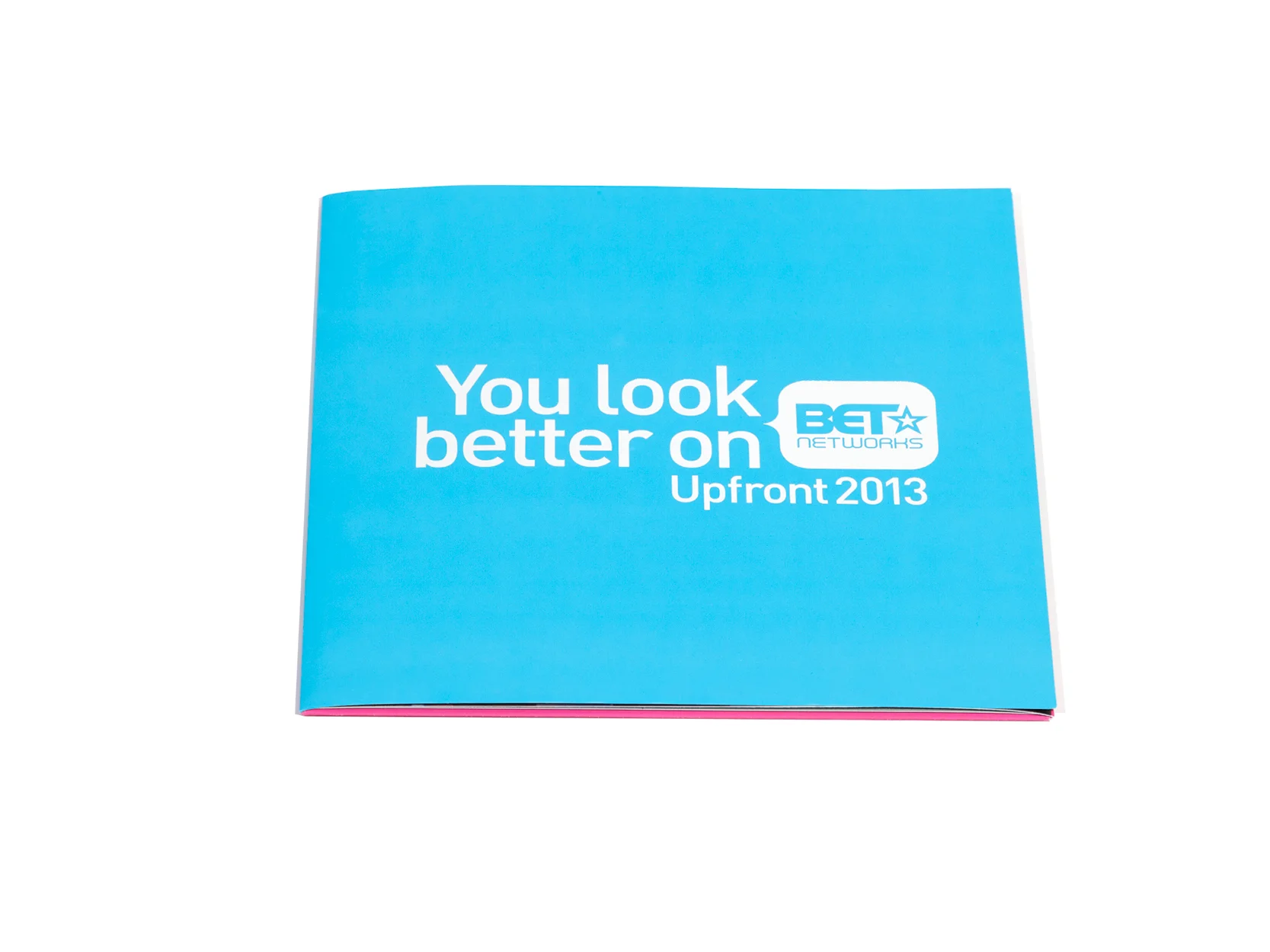
Designing a holiday card for a large corporate entity is a big challenge. It can be tricky striking the delicate balance between lighthearted and professional, while still adhering to the guidelines that come with being part of a large brand. In most cases the card can't use colors, imagery, or language that speaks to a particular religious holiday. It must be different and more creative than previous holiday cards. It needs to be on brand but also festive. Playing with papers and treatments is a great solution to this yearly design dilemma. Because holiday card design season is right around the corner, I've pulled together a collection of corporate cards that navigated through the design parameters and turned out beautifully!


Metallic Paper and Specialty Treatments - What Works, What Doesn't
Metallic paper has always been a go-to for me when working on high-end projects. I've used it for vanity tickets, invitations, holiday cards, leave-behinds, and packaging. It's a great way to add a little sparkle to any print piece (when appropriate of course). However, if you're trying to incorporate some specialty treatments, it can be a finicky paper. Below is a list of paper-and-treatment combinations and the reasons why they do or do not work.
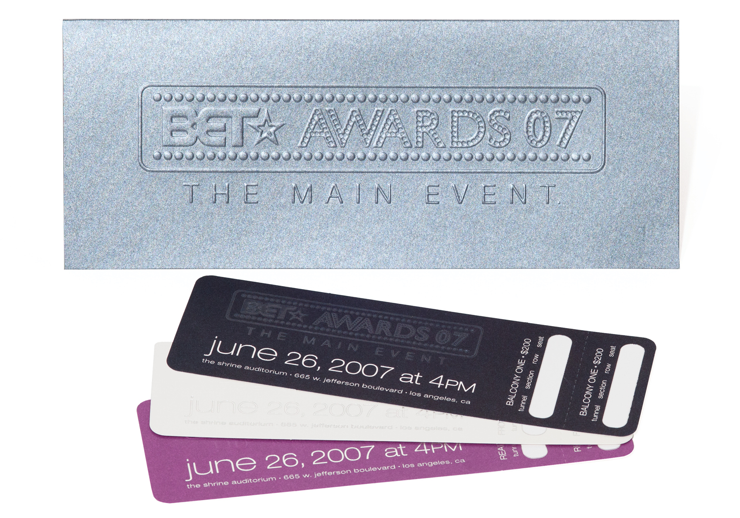
Gmund Reaction - Dark Silver Cloud + Blind Emboss
Metallic Paper + Metallic PMS
NO | Metallic paper is already sparkly and shiny--adding a metallic PMS doesn't make it any sparklier or shinier. This paper also has a particular coating that makes it slick, and a metallic PMS takes FOREVER to dry on this surface.
Metallic Paper + Hologram
RISKY | Holograms can often have a hard time sticking to many metallic papers, so you'll need to work with a printer who is very experienced with them. You should have a few back up papers selected in case your first choice doesn't work. Proceed with caution on this combination.
Metallic Paper + Clear Foil Stamp
NO | Adding a shiny clear foil stamp may look great on a matte paper, but the contrast on a metallic paper isn't great, which makes it a pointless and expensive addition.
Metallic Paper + Metallic Foil
RISKY | If you're using gold or silver foil, it really depends on what you're stamping. If it's a large pattern or a simple shape, it could work. I don't recommend small text; the shiny metallic paper and the shiny text make it almost impossible to read.
Metallic Paper + Black Foil
YES | A black foil stamp looks great on metallic paper! It's even better if you go with a matte finish stamp. The rich black color gives your eye a nice break from all the sparkle.
Metallic Paper + Soft Touch
NO | This is one of those pointless combinations. You're paying a premium for this type of paper, so dulling it down with a soft touch coating doesn't really make sense.
Metallic Paper + Bar Code
NO | This seems like such an obvious combination. You're designing a beautiful vanity ticket or some high-end packaging, why not use a metallic paper! If you need to add a bar code, certain scanners can't read the code when printed directly on this type of paper. In some cases you can test it out ahead of time, but it's an INCREDIBLY risky move with major consequences if it doesn't work out--so for me, it's a no.
Metallic Paper + Blind Emboss
YES | A blind emboss on metallic paper looks amazing! This is definitely a treatment that works well.
Metallic Paper + Die Cutting
YES | Die cutting is another winner that works great with this paper.