Envelope Selection and USPS Surcharges

When it comes to choosing envelopes there are many styles, colors, shapes, and flap styles to consider. There are also US Postal Service (USPS) guidelines and surcharges for different situations.

ColoredEnvelopes.jpg

Different Sizes and Flaps

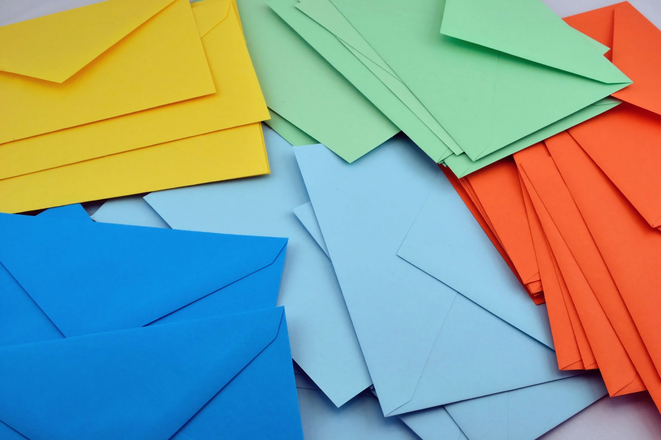
Selecting an envelope size is typically the first thing you do when working with a print piece that needs to be mailed. There are so many pre-made options available, it makes sense to start there, unless you're designing something truly custom. Having a handle on the mailing costs is also important. Below is an assortment of envelopes; I've highlighted the ones that cost more to send. Squares will always cost more because they fall into the category of non-machineable. This means they need to be hand sorted since they can not be fed through the machine. There are also a variety of additional situations beyond size that might result in your envelope being non-machineable, including weight, thickness, uneven thickness, rigidity, etc.

Envelopes come in a variety of flap styles. Almost all envelopes can be found with either square or rounded square flap. My favorite, Euro flap, which is a bit more elegant and perfect for invitations or holiday cards, is readily available in most sizes but can be a little tricky to locate if you also have a very specific paper type or paper color in mind.

Selecting Colors

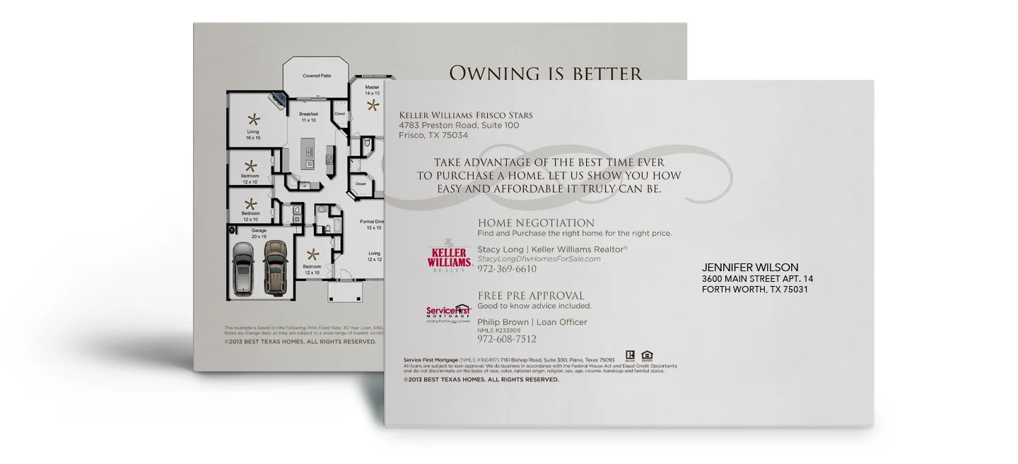
Selecting colored envelopes is a great way to add an additional punch of personality to a mailing. The site I use to find and purchase colored envelopes is Envelope Mall. I love that they tell you the exact swatch the envelope is made from. Paper-Source is also good if you're looking for a particular color in euro flap and can't find it anywhere else. Paper-Source is a bit more expensive, and they don't tell you the swatch, but you could easily order a small quantity and check the color or if you have a Paper-Source store close by, go to the store and match it up with a Pantone chip and then tweak your design so they match up (assuming it's not a corporate color). If there is no way to match the envelope to the print piece, I like to contrast. For example, with a kraft paper envelope or something shimmery. Keep in mind that the post office prints a bar code on the bottom of envelopes, if the bar code can't be read because of the envelope color (the bar code is printed in black), they add a big white sticker to the bottom of the envelope to they can print the bar code on top. This really takes away from the effect of a beautiful envelope, so when selecting colors, make sure to consider this.

Pre-made vs. Custom

If you're printing a simple logo on an envelope (most likely the flap) you can still use a pre-made style. If you've designed something more elaborate--like printing a pattern on the inside, full color bleed on the flap, any type of foil, embossing, special die cut or a special size--you'll need to go with a custom envelope, which can be easily created by your printer but will cost a bit more.

Do you have any questions or need suggestions about envelope colors or styles? Let me know!


Setting up Files for Large Format

Wide-format or large-format printers are used for large signage: billboards, elevator wraps, vehicle wraps, etc. File set-up can be a bit intimidating when working with large format, especially for the bigger pieces, but if you understand what the final output should be and how to scale appropriately, you can design with confidence.

Final Output

When dealing with standard offset or digital printing, 300dpi is the norm. However, with large format it isn't necessary, nor is it possible in most cases, to build a file at full resolution. An important first step to setting up your file is asking your printer what the "final output" should be. This is the resolution at full printed size. Different pieces have different final outputs: larger pieces seen at a distance might have a minimum final output of 75dpi, while pieces that are a bit smaller and will be viewed up close might have a final output of 100 or 150dpi The printer will be able to provide a minimum final output or a range that you should try to stay within.

Scale

Using a scaled-down file when working with large format makes files much more manageable. With some pieces (usually die-cut pieces or vehicle wraps), there may be a preexisting template available already set up to scale, or the printer/vendor may have a specific scale they would like to use, so asking is important. If the vendor doesn't have a template or a specific scale they'd like, it's up to the designer to designate one that makes sense. 

When I'm dictating my own scale, I like to build the file out around 30" in either direction. It's a comfortable size and one I know my computer can handle. There are 3 ways to explain the scale you're using: as a percentage of the final size (25% of final size), as a fraction of the size (built at 1/4 size), or as a scale (1/4"=1"); all are correct, but depending on the scale you use, you'll probably gravitate to one or the other (1/8"=1' is a lot easier to wrap your mind around than 1.04% of final size or built at 1/96 size). When I'm working with scale, I always like to make sure I'm working with the cleanest numbers possible. So if you try a scale of 1/6 size and you have a decimal point with 10 numbers after it, try a different scale–maybe 1/7 or 1/5 is a better match. It's just a matter of figuring out the best and cleanest way to scale. After you decide on a nice clean scale, you need to figure out what your resolution needs to be at that scale, which will require a little math. If you set your file up at 1/5 and the final output is 100, then the file needs to be set up at 500dpi in order for your final output to be 100dpi. Below I have a few examples.


Examples

PROJECT 36"x72" Wildposter
FINAL OUTPUT 200dpi
SCALE / RESOLUTION 1/2 size (18"x36") @ 400dpi
HOW? 36÷2=18 and 72÷2=36 | 200x2=400
WHY?
Half size is the perfect choice for this project, it produces a nice clean number and is around the size I like to work within. The next step is figuring out the resolution at 1/2 size in order to meet the desired final output. I multiplied the desired output by 2 since we are working at half size.


PROJECT 10'5"x22'8" 8 Sheet Poster
FINAL OUTPUT 50dpi
SCALE/RESOLUTION 1/10 size (12.5"x27.2") @ 500dpi
HOW? For this piece, because we're working with feet and inches, the first step is converting to total inches.
10x12=120 and 120+5=125 | 22x12=264 and 264+8=272
125÷10=12.5 and 272÷10=27.2 | 50x10=500
WHY?
1/10 size is a great choice for this piece. 1/11 and 1/12 size produce a really messy number but 1/10 size produces a pretty good one with only 1 number after the decimal point. The next step is figuring out the resolution at 1/10 size. I multiplied the desired final output of 50 by 10 since we are working at 1/10 size.


Working with large format takes practice, but the more you work with it, the more confident you'll become at building large printed pieces.


Designing Security Conscious Vanity Tickets

In my 10+ year career in the entertainment industry, I have designed a great deal of vanity tickets, which are custom designed for an event. They are fun, high-profile projects that, for large events, thousands of people will be looking at. But when you're dealing with event tickets, there are very real security issues to consider, so understanding security when it comes to design is important. There are 3 main styles of vanity tickets: General Admission; Ticket Stub; and Barcode Style. Each style has distinct differences and varying degrees of security. The style of ticket that you choose is dependent on how the event is structured and the venue's capabilities.

General Admission - Low Security

This style of ticket is used at events where there is no assigned seating. This style is very easy to photocopy so if the event is secure, adding at a minimum a hologram makes duplication more difficult.


Ticket Stub Style - Medium Security

This style of ticket is used at events where there is assigned seating. The same hologram rules apply here but there is a second layer of security since these tickets have seat numbers. Seat numbers won't necessarily keep counterfeit tickets out, but if two people have duplicate seats, you have people wandering around or people sitting in the wrong seats the security team has an easier time investigating.


Barcode Style - Medium-High Security

This style of ticket is used in events where the venue is set up to read barcodes. The same hologram rules apply here but there is a second and third layer of security with the seat numbers and added barcode. It is more secure than the other two styles since each barcode is unique and specific to that venue. The system understands which barcodes are valid and which ones have already been scanned. So although someone could technically reproduce the barcode if they had access to your ticket, the design of the ticket should be unique enough to immediately alert ushers that it is a fake.


Counterfeiters are very good, so making the design unique, difficult to reproduce and easy to identify as the real thing is very important for all three styles. The higher the security the more unique the ticket should be. Think about how many security features a drivers license or dollar bill has. Using complicated die cuts, foils, holograms, heat sensitive and invisible inks, and interesting papers are all great ways to enhance the security of a ticket.

Understanding the ticket styles and security concerns is crucial to the design and event-planning process. You don't want security pandemonium because you didn't plan vanity tickets out appropriately. Knowing the challenges will set you off on the right track to avoid the issues that can turn a fun event into a security disaster.