Stock Photography | The good and the bad

When you're using stock photography a lot can go wrong. The trick to using these photos is selecting pictures that feel natural and inviting. When you use photos that feel artificial or uninviting, all of a sudden you feel less trustworthy to the client which can hurt your business. The goal is to use images that your customers and potential clients can relate to. Let's quickly breeze through what you shouldn't be using and why.

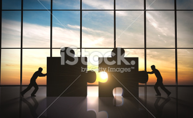
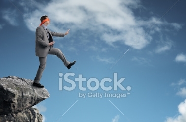
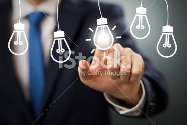
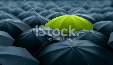
Things that could never happen

One of the most important aspects of picking photos is making sure they feel realistic and appropriate for your business. Most conceptual images are impersonal, confusing and do nothing more than add a graphic to a piece of paper. These can really distract from your message.


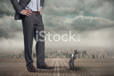
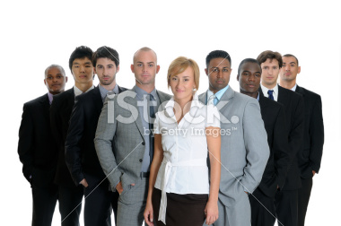
Inflating your Company

When people look at your marketing materials or website, they're not only looking at what you offer but they want to get a feel for who you are. If you're misrepresenting yourself with photos that inflate, they don't get a very clear picture which can be off-putting.
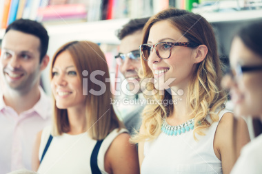
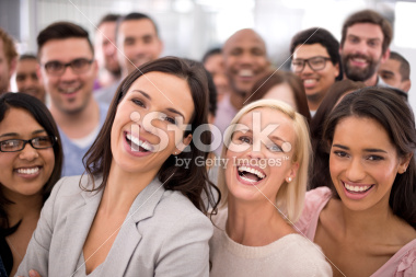
 

Overly Happy People

I'm sure there are a lot of people who are excited to be working, but I'd give most people about a 3-5 on the exuberance scale. Even if your job or office is really fantastic, don't show people at an 11, it just feels unrealisitc to be that excited at work.
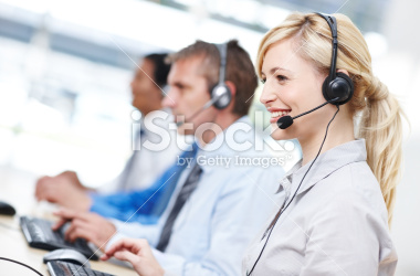
 

Direct Eye Contact

These types of images just don't feel natural. If you need a shot of someone looking into the camera, try a shot of only one person looking, a whole group just makes the photo feel manufactured.
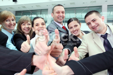
 

Handshakes

I'm sure there are lots of people that shake hands on a regular basis but these types of photos are terribly overused. If you want to set yourself apart from other companies, don't use this style of photography.


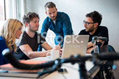
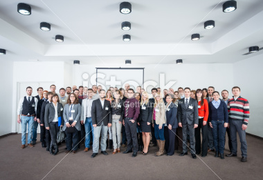
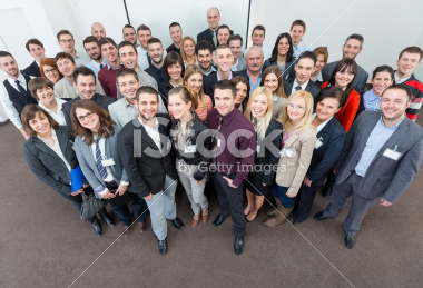
So, what should you be using? The photos you use should feel like ones you could potentially take. They should feel consistent with the type of company you are or that you're promoting. If you're looking for images of people, they should feel natural and look like the type of person you're targeting, both in dress, context and overall style. The best thing to do if you're unsure is write down your ideal image, What does that picture look like? What is the tone? What is happening in the photo? Go into your search with a very specific image in mind, a lot of times you'll find it, if you can't find exactly what you're looking for, you can compromise a little bit but if you go in with no parameters a lot of times you'll end up with a really cliché picture.

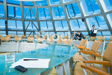
I've pulled a few photos that feel more natural and realistic for business images, I hope these guidelines help you on your next search!


Setting up Files for Large Format

Wide-format or large-format printers are used for large signage: billboards, elevator wraps, vehicle wraps, etc. File set-up can be a bit intimidating when working with large format, especially for the bigger pieces, but if you understand what the final output should be and how to scale appropriately, you can design with confidence.

Final Output

When dealing with standard offset or digital printing, 300dpi is the norm. However, with large format it isn't necessary, nor is it possible in most cases, to build a file at full resolution. An important first step to setting up your file is asking your printer what the "final output" should be. This is the resolution at full printed size. Different pieces have different final outputs: larger pieces seen at a distance might have a minimum final output of 75dpi, while pieces that are a bit smaller and will be viewed up close might have a final output of 100 or 150dpi The printer will be able to provide a minimum final output or a range that you should try to stay within.

Scale

Using a scaled-down file when working with large format makes files much more manageable. With some pieces (usually die-cut pieces or vehicle wraps), there may be a preexisting template available already set up to scale, or the printer/vendor may have a specific scale they would like to use, so asking is important. If the vendor doesn't have a template or a specific scale they'd like, it's up to the designer to designate one that makes sense. 

When I'm dictating my own scale, I like to build the file out around 30" in either direction. It's a comfortable size and one I know my computer can handle. There are 3 ways to explain the scale you're using: as a percentage of the final size (25% of final size), as a fraction of the size (built at 1/4 size), or as a scale (1/4"=1"); all are correct, but depending on the scale you use, you'll probably gravitate to one or the other (1/8"=1' is a lot easier to wrap your mind around than 1.04% of final size or built at 1/96 size). When I'm working with scale, I always like to make sure I'm working with the cleanest numbers possible. So if you try a scale of 1/6 size and you have a decimal point with 10 numbers after it, try a different scale–maybe 1/7 or 1/5 is a better match. It's just a matter of figuring out the best and cleanest way to scale. After you decide on a nice clean scale, you need to figure out what your resolution needs to be at that scale, which will require a little math. If you set your file up at 1/5 and the final output is 100, then the file needs to be set up at 500dpi in order for your final output to be 100dpi. Below I have a few examples.


Examples

PROJECT 36"x72" Wildposter
FINAL OUTPUT 200dpi
SCALE / RESOLUTION 1/2 size (18"x36") @ 400dpi
HOW? 36÷2=18 and 72÷2=36 | 200x2=400
WHY?
Half size is the perfect choice for this project, it produces a nice clean number and is around the size I like to work within. The next step is figuring out the resolution at 1/2 size in order to meet the desired final output. I multiplied the desired output by 2 since we are working at half size.


PROJECT 10'5"x22'8" 8 Sheet Poster
FINAL OUTPUT 50dpi
SCALE/RESOLUTION 1/10 size (12.5"x27.2") @ 500dpi
HOW? For this piece, because we're working with feet and inches, the first step is converting to total inches.
10x12=120 and 120+5=125 | 22x12=264 and 264+8=272
125÷10=12.5 and 272÷10=27.2 | 50x10=500
WHY?
1/10 size is a great choice for this piece. 1/11 and 1/12 size produce a really messy number but 1/10 size produces a pretty good one with only 1 number after the decimal point. The next step is figuring out the resolution at 1/10 size. I multiplied the desired final output of 50 by 10 since we are working at 1/10 size.


Working with large format takes practice, but the more you work with it, the more confident you'll become at building large printed pieces.


Designing Security Conscious Vanity Tickets

In my 10+ year career in the entertainment industry, I have designed a great deal of vanity tickets, which are custom designed for an event. They are fun, high-profile projects that, for large events, thousands of people will be looking at. But when you're dealing with event tickets, there are very real security issues to consider, so understanding security when it comes to design is important. There are 3 main styles of vanity tickets: General Admission; Ticket Stub; and Barcode Style. Each style has distinct differences and varying degrees of security. The style of ticket that you choose is dependent on how the event is structured and the venue's capabilities.

General Admission - Low Security

This style of ticket is used at events where there is no assigned seating. This style is very easy to photocopy so if the event is secure, adding at a minimum a hologram makes duplication more difficult.


Ticket Stub Style - Medium Security

This style of ticket is used at events where there is assigned seating. The same hologram rules apply here but there is a second layer of security since these tickets have seat numbers. Seat numbers won't necessarily keep counterfeit tickets out, but if two people have duplicate seats, you have people wandering around or people sitting in the wrong seats the security team has an easier time investigating.


Barcode Style - Medium-High Security

This style of ticket is used in events where the venue is set up to read barcodes. The same hologram rules apply here but there is a second and third layer of security with the seat numbers and added barcode. It is more secure than the other two styles since each barcode is unique and specific to that venue. The system understands which barcodes are valid and which ones have already been scanned. So although someone could technically reproduce the barcode if they had access to your ticket, the design of the ticket should be unique enough to immediately alert ushers that it is a fake.


Counterfeiters are very good, so making the design unique, difficult to reproduce and easy to identify as the real thing is very important for all three styles. The higher the security the more unique the ticket should be. Think about how many security features a drivers license or dollar bill has. Using complicated die cuts, foils, holograms, heat sensitive and invisible inks, and interesting papers are all great ways to enhance the security of a ticket.

Understanding the ticket styles and security concerns is crucial to the design and event-planning process. You don't want security pandemonium because you didn't plan vanity tickets out appropriately. Knowing the challenges will set you off on the right track to avoid the issues that can turn a fun event into a security disaster.